Case Study
Sparkway
Creating the foundations for a new mobility brand. Strategy, naming, localisation and launch for an all-electric mobility service in Portugal.
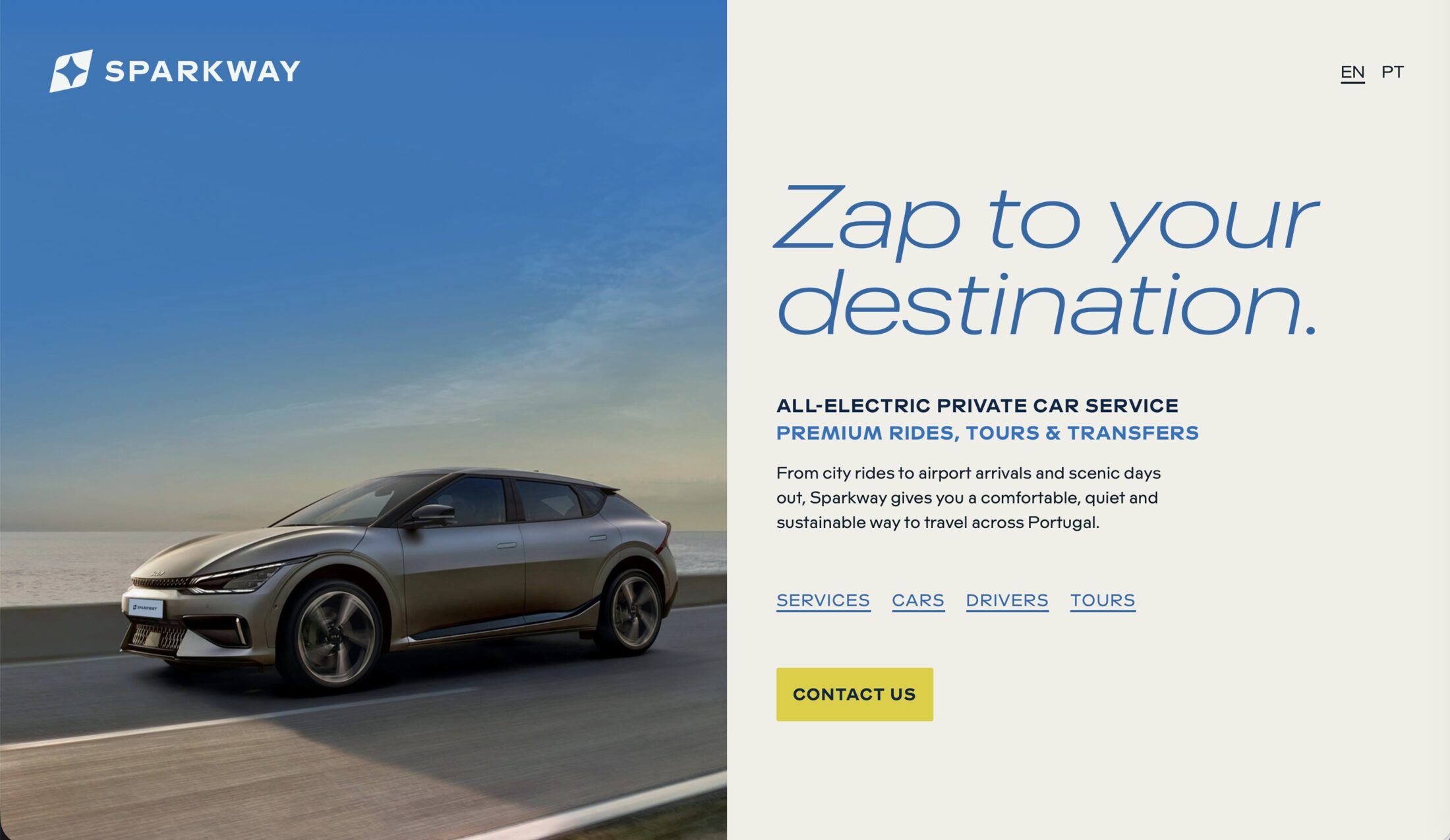
Sparkway began as an idea for an all-electric private car service in Portugal.
The client had a clear commercial ambition but almost nothing else: no name, positioning, visual identity, website or shared language for describing the business. What started as a small service in Lisbon soon evolved into a broader proposition, expanding across Portugal and introducing driver recruitment alongside customer-facing services.
Working closely with Letra Studio, I helped turn that early idea into a launch-ready brand. My work focused on strategy, content development, recruitment, and service design, while collaborating on naming, localisation and the overall brand direction. Together, we established a shared strategic foundation that guided every stage of the project, from the first positioning workshop to the public launch.
Role
Strategy · Project coordination · Content development · Recruitment journey
In collaboration with Letra Studio
Naming · Brand development · Localisation
Languages
English, European Portuguese
Launched
July 2026
Project constraints
The challenge
The visible task was to build a website. The real task was to create enough clarity for the website, and the business behind it, to work consistently.
Before choosing a name or writing a headline, we needed to answer more fundamental questions:
- Who was the service for?
- What did “premium” mean in practice?
- How should the company speak?
- What could it credibly promise?
- How would those decisions remain consistent as the business grew?
Rather than manage branding, copywriting and web design as separate deliverables, we treated them as parts of one connected system. This gave the project a clear sequence: define the business first, then build the brand and customer experience around it.
Strategy
Define the business before designing it
Before naming the company or designing the website, we needed to agree on what Sparkway stood for. We created three working documents that became the basis for every later decision.
- Brand Strategy defined the market position, target audience and value proposition.
- Tone of Voice established how the company should communicate across customer, driver and operational touchpoints.
- Copywriting Foundation translated those principles into reusable messages before individual pages were written.
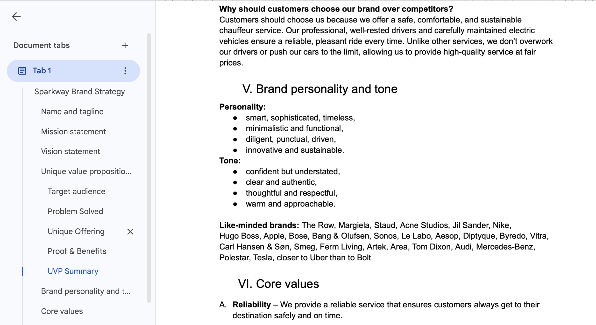
These were not presentation documents created and forgotten. They became practical decision-making tools. When questions arose about terminology, service promises, page structure or calls to action, we could test each option against the same agreed foundation instead of reopening the wider strategic discussion.
This reduced ambiguity, kept contributors aligned and allowed the website work to move forward with fewer subjective debates. Only once those foundations were in place did we begin designing and writing the website itself.
Positioning
Premium without the luxury clichés
One of the first presentations we received looked exactly like what people usually imagine when they hear “premium transport”: black backgrounds, gold accents and luxury language. We deliberately went in a different direction.
We defined premium through the quality of the experience rather than through status. That decision shaped the visual identity, terminology and service messaging.
Instead of
- Exclusivity
- Chauffeurs
- Luxury vehicles
- Status-led language
We focused on
- Reliability
- Professional drivers
- Premium all-electric cars
- Comfort and thoughtful service
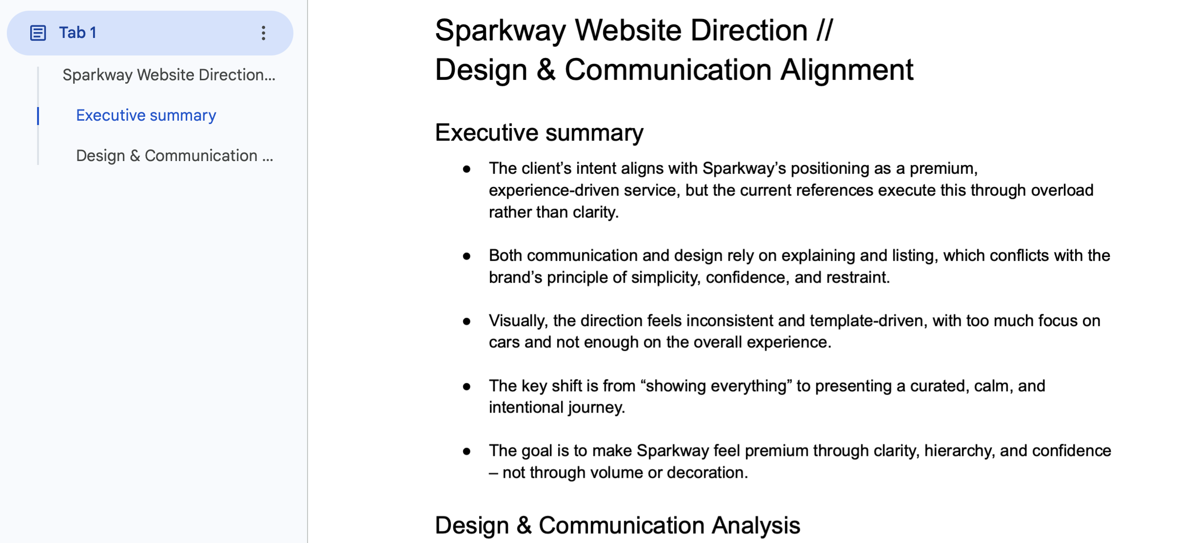
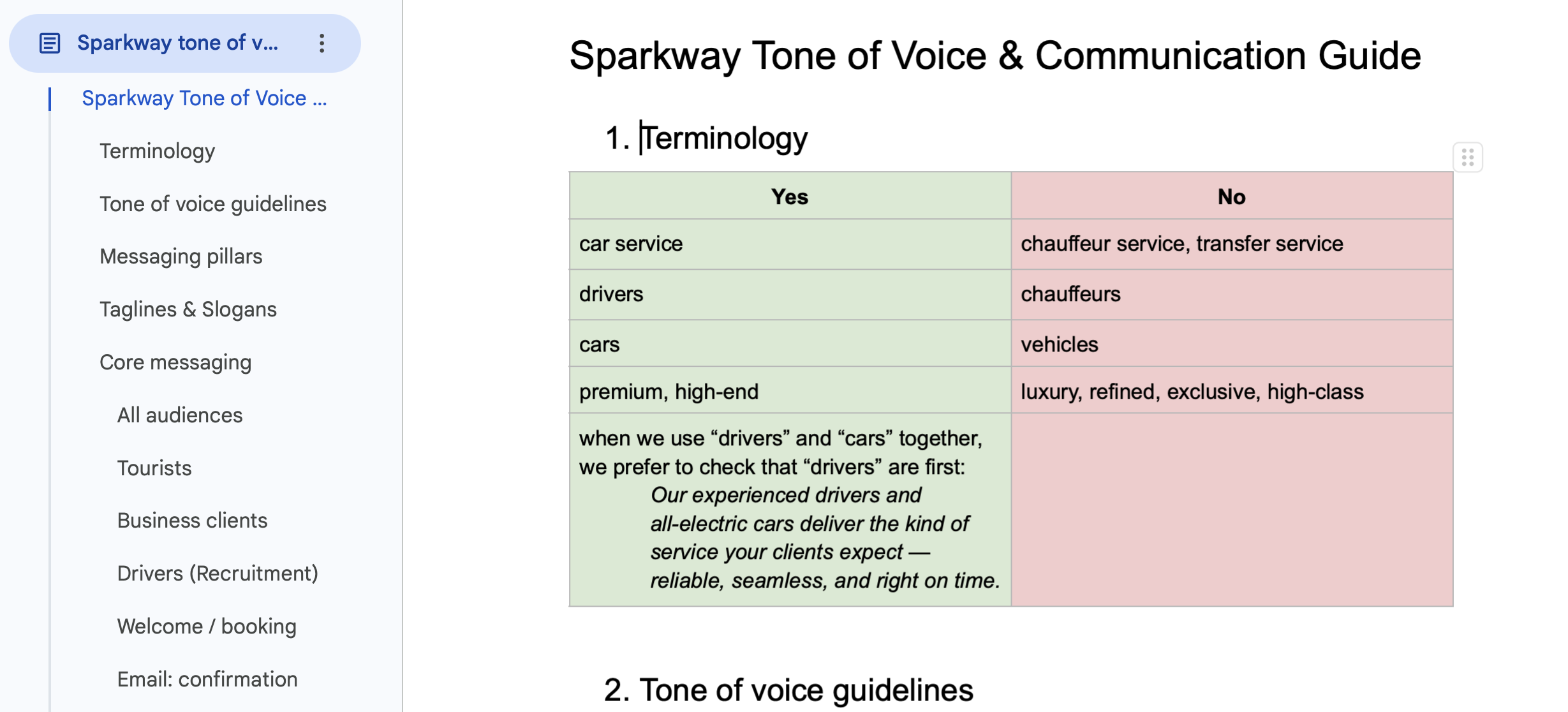
These copy choices translated the positioning into language customers could understand and the business could realistically deliver. The result is a brand that feels modern and confident without relying on the visual and verbal conventions of luxury transportation.
Naming
Naming a brand built to grow
Once the positioning was clear, naming became more focused, though not necessarily easier.
The original working name, Boggy, no longer matched the direction of the business. We needed a name that felt modern, distinctive and international, while remaining easy to pronounce in both English and Portuguese.
Across several rounds, we explored dozens of naming directions. We assessed each against a practical set of criteria, including meaning, memorability, pronunciation, brand fit and domain availability.
- Meaning
- Memorability
- Pronunciation
- Brand fit
- Domain availability
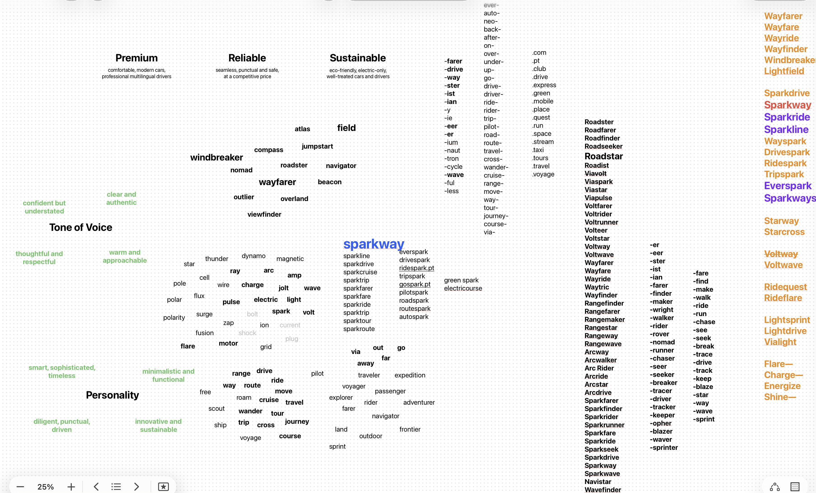
That process led to Sparkway. The name combines movement with electric energy without sounding overly technical or relying on familiar sustainability clichés. It also gave us a strong foundation for a brand intended to expand beyond its original Lisbon launch.
Localisation
Localising the brand for Portugal
Creating the English version of the website was only part of the project. Every page then had to be adapted into European Portuguese without becoming a literal translation.
Rather than translating sentence by sentence, we adapted the messaging so that it felt natural to Portuguese speakers while preserving the same positioning, tone of voice and customer experience. This included terminology, navigation, service descriptions, calls to action and recruitment messaging.

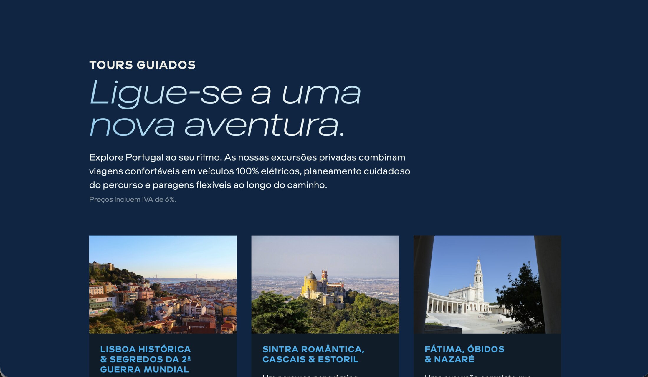
The goal was consistency without sameness: both language versions needed to express the same positioning and customer promise, while sounding as though they had been written for their audience rather than translated from another language.
This required continuous coordination between strategy, copy and design, particularly where differences in sentence length, terminology or tone affected the page structure.
Scope management
Extending the scope from customers to drivers
As the project progressed, the business model evolved. Sparkway was no longer preparing only to attract customers. It also needed to recruit professional drivers as the fleet expanded.
This introduced a second audience, a new user journey and additional legal and operational requirements. Rather than bolt recruitment onto the finished website, we incorporated it into the same brand and service system.
The recruitment experience needed to do two things at once:
- attract experienced drivers who matched the company’s standards;
- strengthen customer trust by making those standards visible.
We reviewed the driver agreement and application requirements, identified the information needed at each stage, and redesigned the flow around that sequence.
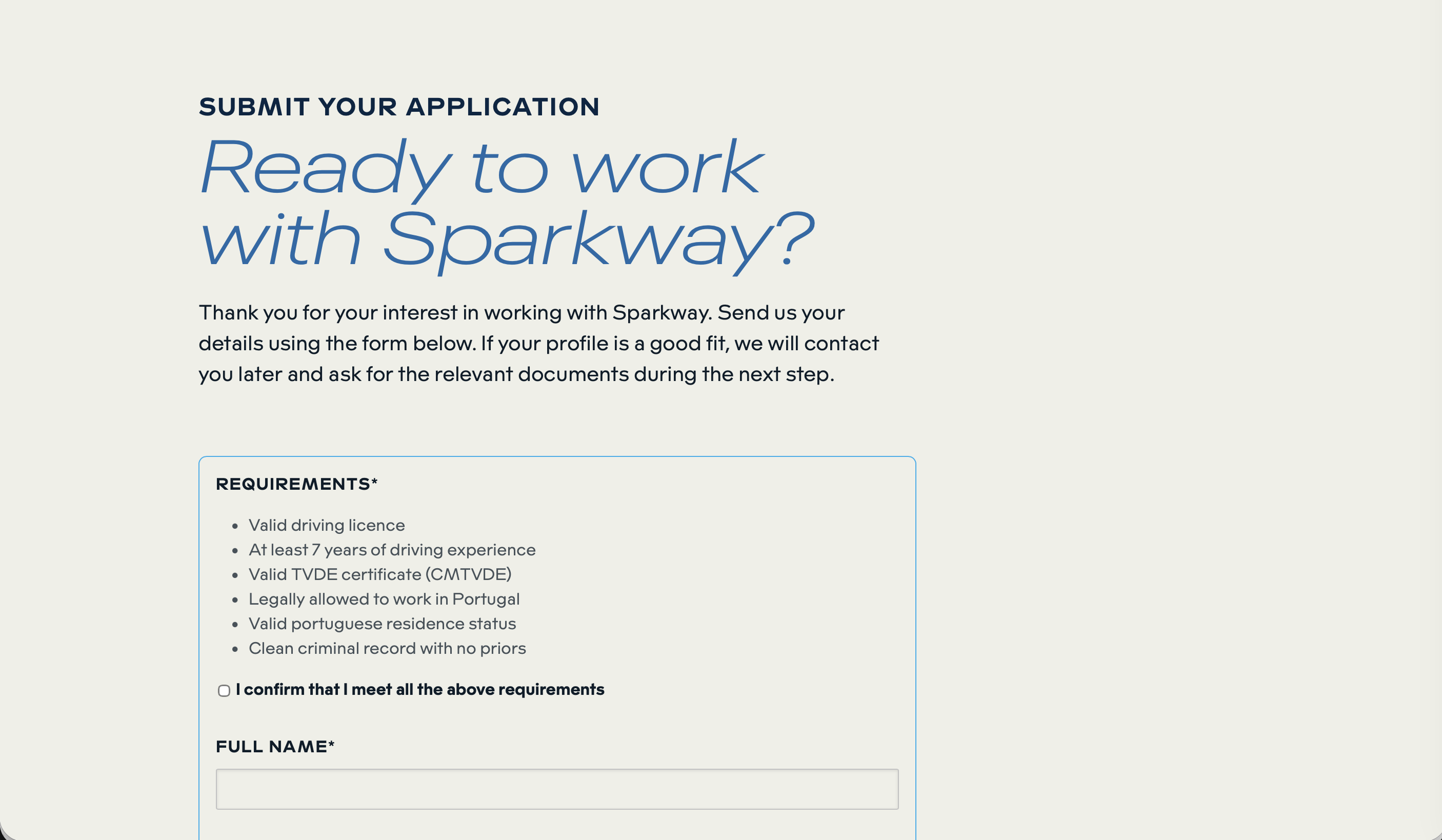
This allowed us to:
- explain expectations in plain language;
- avoid requesting sensitive documents before they were needed;
- keep the application journey aligned with GDPR principles;
- present Sparkway as professional and respectful from the first interaction.
The result was a structured recruitment journey that supported hiring, compliance and brand perception at the same time.
Delivery
Launch
Sparkway launched on 14 July 2026 with a complete bilingual website in English and European Portuguese, available in both light and dark colour schemes. The launch covered four connected pages in each language.
- Long-form landing page
- Driver recruitment page
- Application confirmation page
- Privacy Policy
The launch also included a complete visual identity for the new brand: logo, colour palette, typography, favicon and light and dark colour schemes, creating a consistent system across the website and future communications.
The final product brought together strategy, naming, positioning, visual identity, messaging, localisation, customer experience, driver recruitment and privacy compliance into one coherent brand and service experience.
More importantly, the project gave Sparkway a foundation it could continue to build on. New services, locations, recruitment materials and customer communications could now be developed from the same strategic, verbal and visual system rather than defined from scratch.
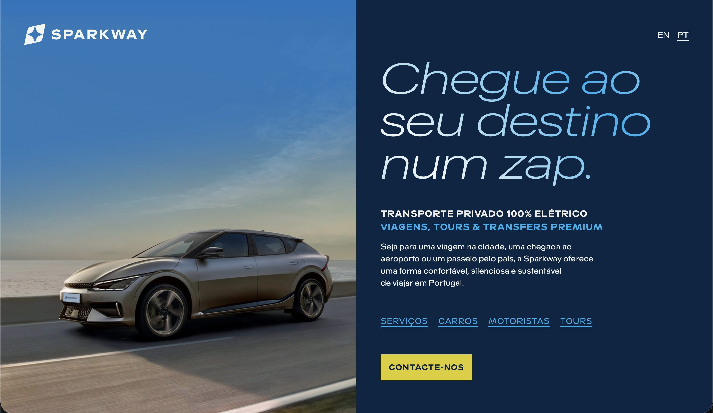
What began as a loosely defined business idea became a coherent, launch-ready brand with a clear proposition for both customers and drivers.